UK Population data - interpreting infographics
Submitted by Maggie Harnew on 25 October 2015.
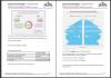
The Office of National Statistics (ONS) is a rich source of data, charts and graphs.In particular, infographics are becoming ever more popular. They can tell complex statistical stories in an easy to grasp manner but also open doors to further mathematical interpretation and investigation.
A set of challenging questions based three ONS charts about the UK population in June 2014. Can be used as a general discussion prompt about population and migration, whilst also improving skills with large numbers, percentages, interpreting charts and much more.
Editor’s note
Apologies, the link (to the ONS site) in the PDF is too long and doesn’t work. To view the original infographic please use the link below.
Resource File(s)
Resource type
Physical format
5 page PDF inc answers & Functional Maths mapping
Level
Maths
- Log in to post comments
See also
More like this