UK Labour Market - interpreting infographics
The Office of National Statistics (ONS) is a rich source of data, charts and graphs.In particular, infographics are becoming ever more popular. They can tell complex statistical stories in an easy to grasp manner but also open doors to further mathematical interpretation and investigation.
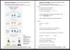
A set of challenging differentiated questions (E3 to L2+) based on a recent ONS infographic about the UK Labour Market from July-September 2015. Can be used as a general discussion prompt about UK employment, whilst also improving skills with large numbers, percentages, interpreting diagrams and much more.
Editor’s note
Apologies, the link (to the ONS site) in the PDF is too long and doesn’t work. To view the original infographic please use the link below.
http://tinyurl.com/pwqgdgp
- Log in to post comments